(2020)
UI DESIGN • ICONOGRAPHY
BRANDING • ILLUSTRATION
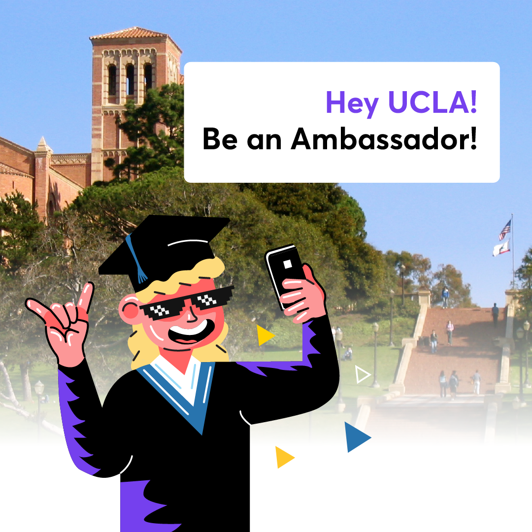
SOCIAL MEDIA MARKETING
Client
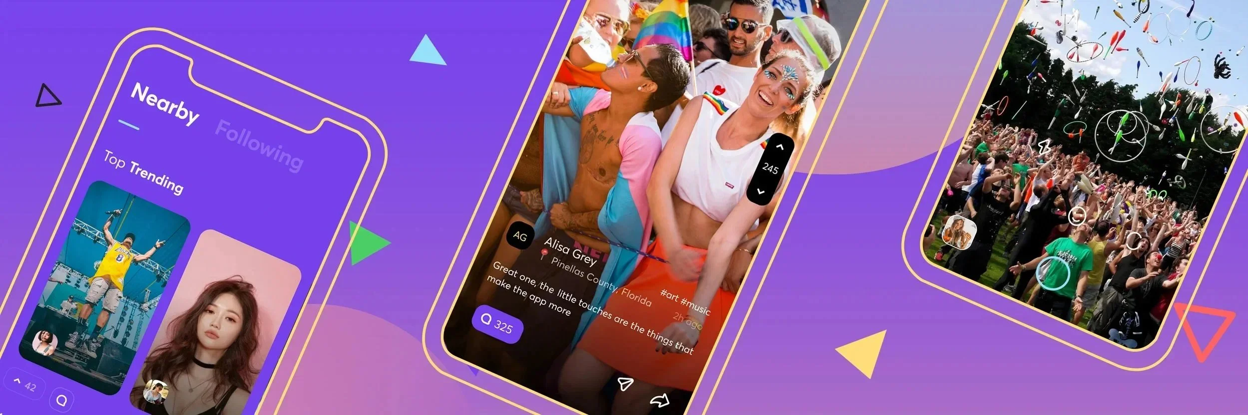
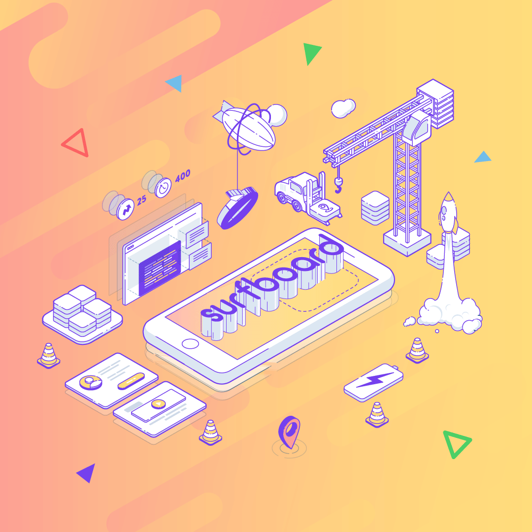
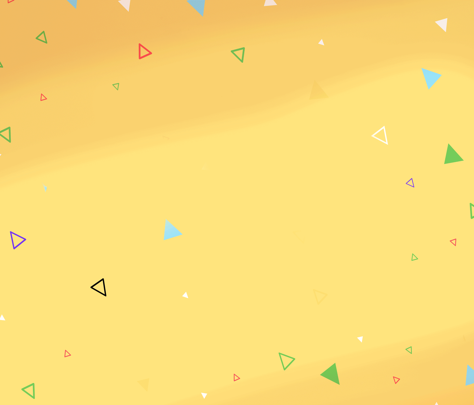
Surfboard
Overview
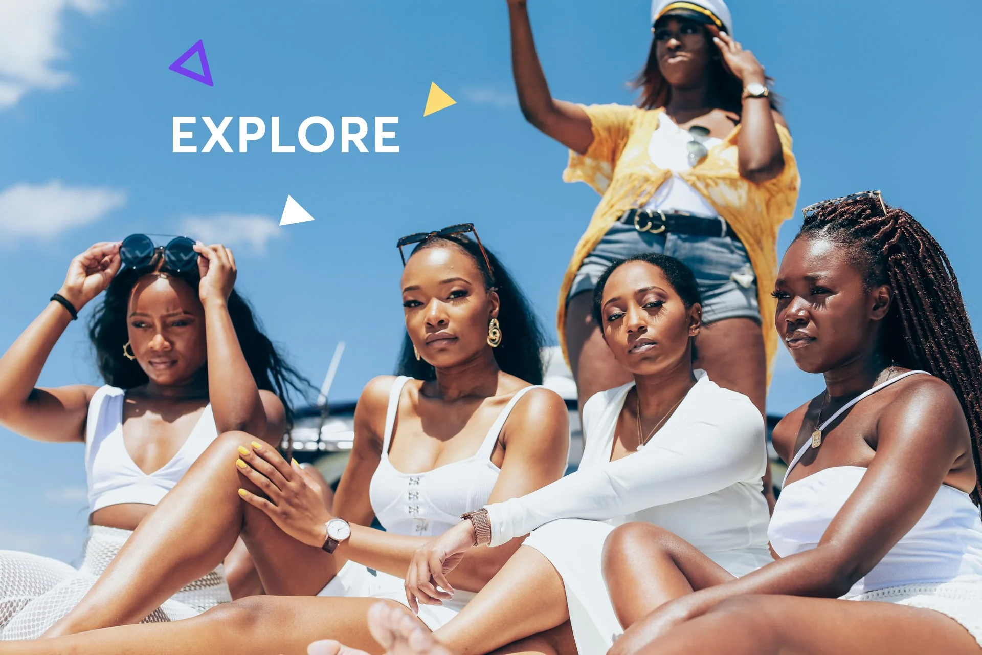
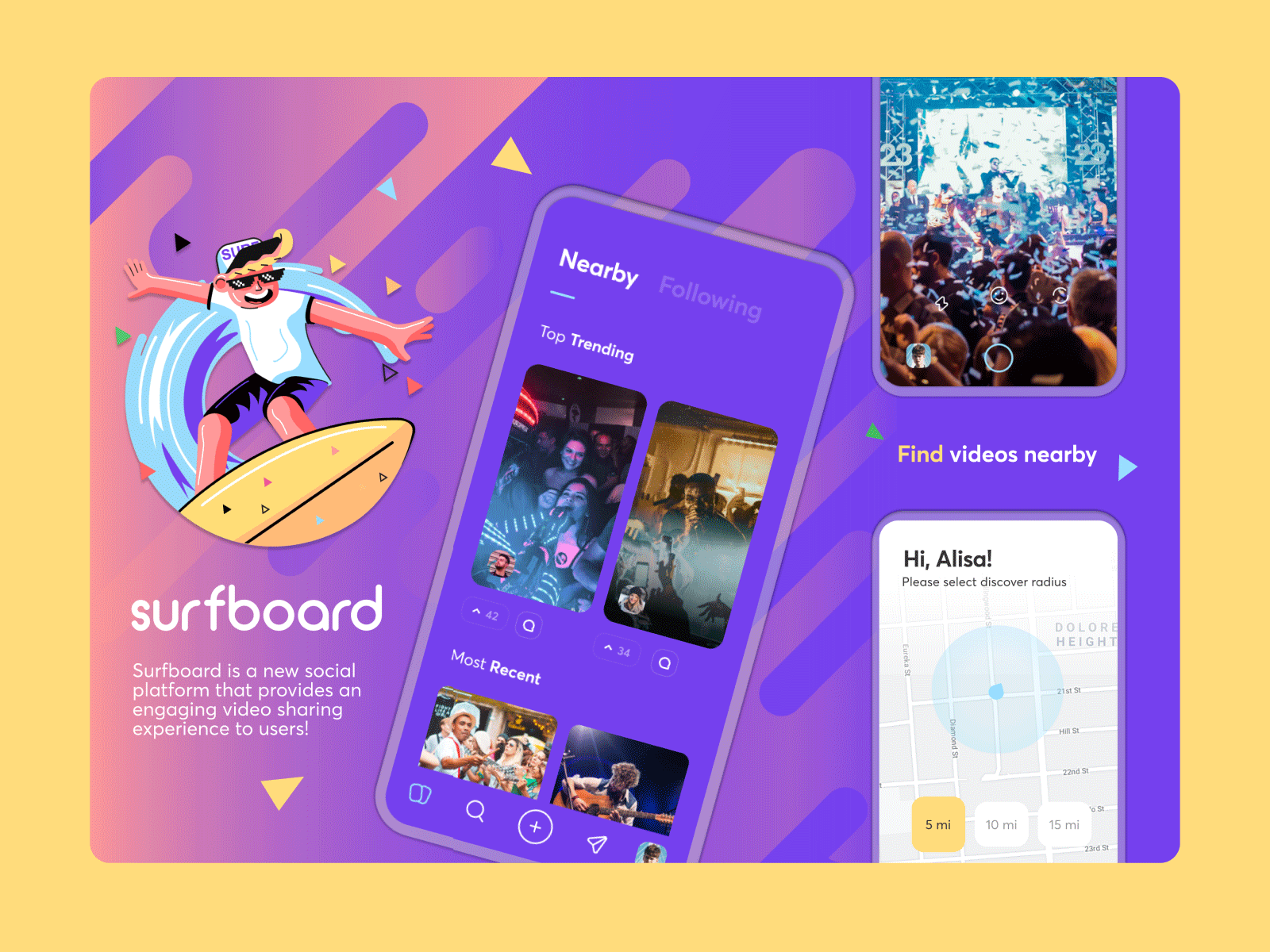
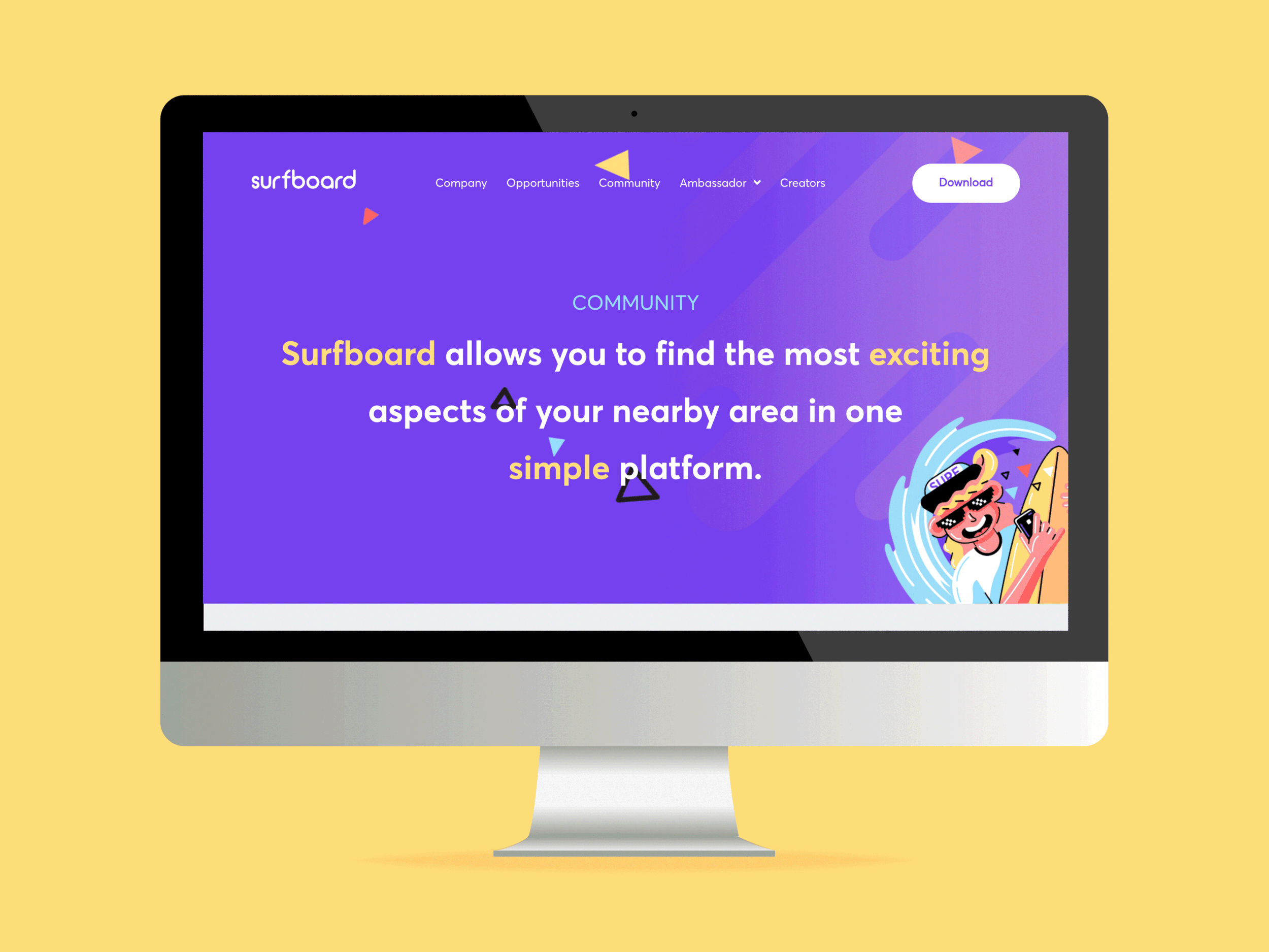
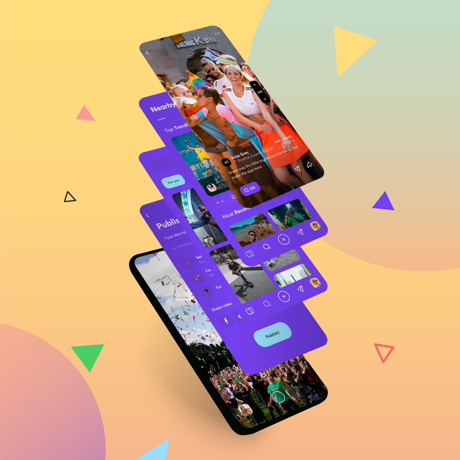
Surfboard is a geolocation app for sharing videos with people within a 15-mile radius of your location. Along with sharing, you could “surf” for trending and local content.
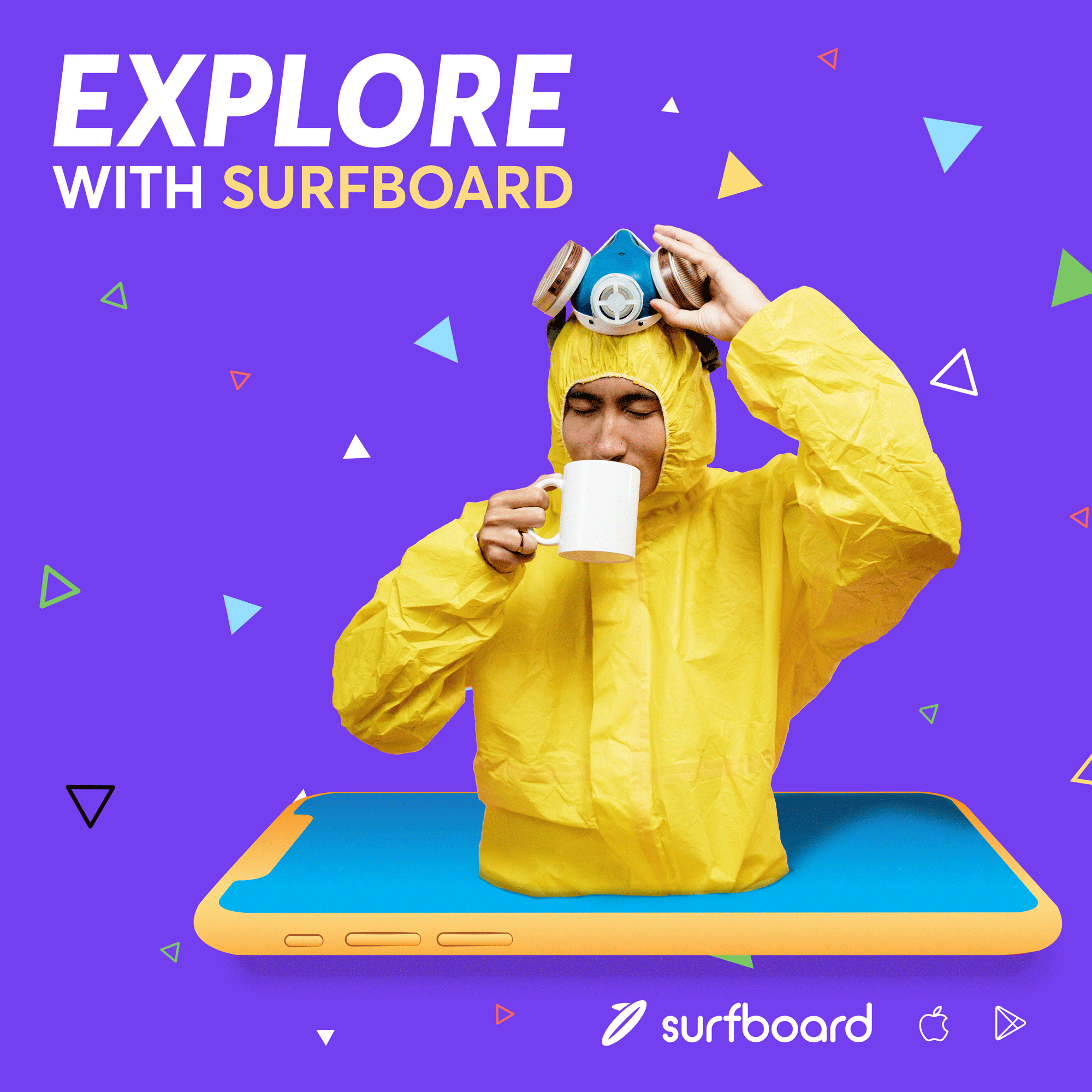
My objective was to create a consistent user interface, along with cohesive marketing materials, with the goal of it all coming together as a unified branding system that fits the exciting young vibe of the audience we were targeting.
Impact
The branding came together cohesively and it was rewarding to be a part of the app development process and gain a deeper knowledge in UI.
Unfortunately, the Surfboard project came to an end in November of 2020, with complications from COVID, which is a shame because I really believed in the vibe we had created for the product.
Timeline
5 months
Project Scope
Mascot refinement, UI design of the app (some UX), pitch decks for investors, materials for social media, marketing concepts, and assisting in website functionality.
Execution
The materials were designed almost exclusively on Figma, as it allowed our team to effectively collaborate and exchange feedback quickly. Any illustration work I created would be done in Adobe Illustrator and imported into Figma. Projects were tracked in Asana with communication using Slack.
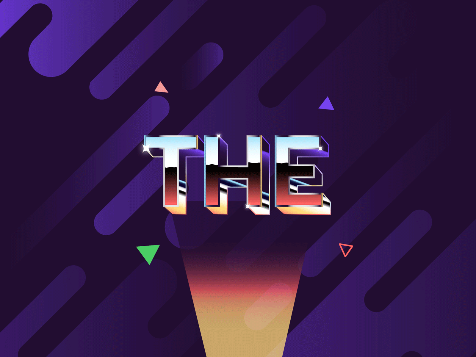
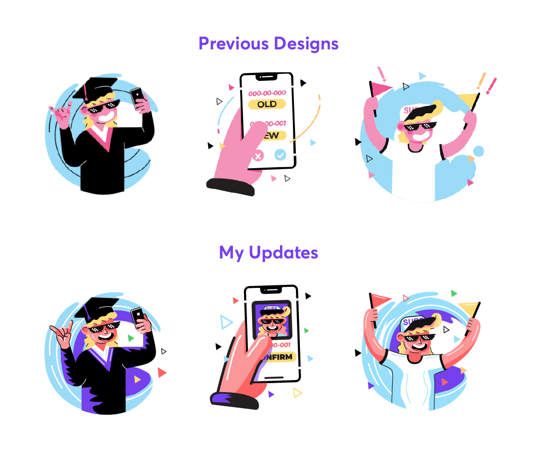
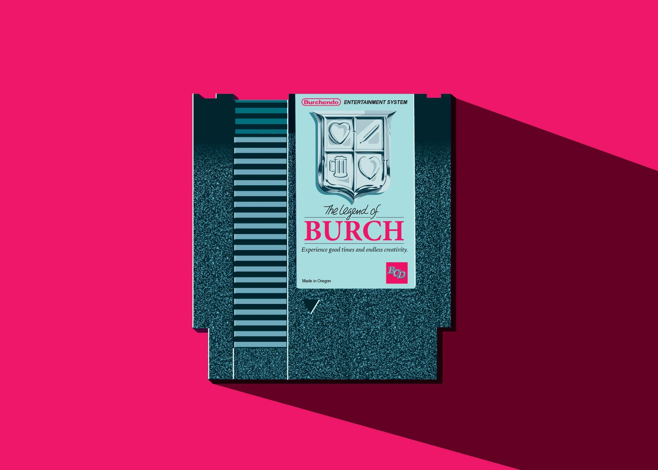
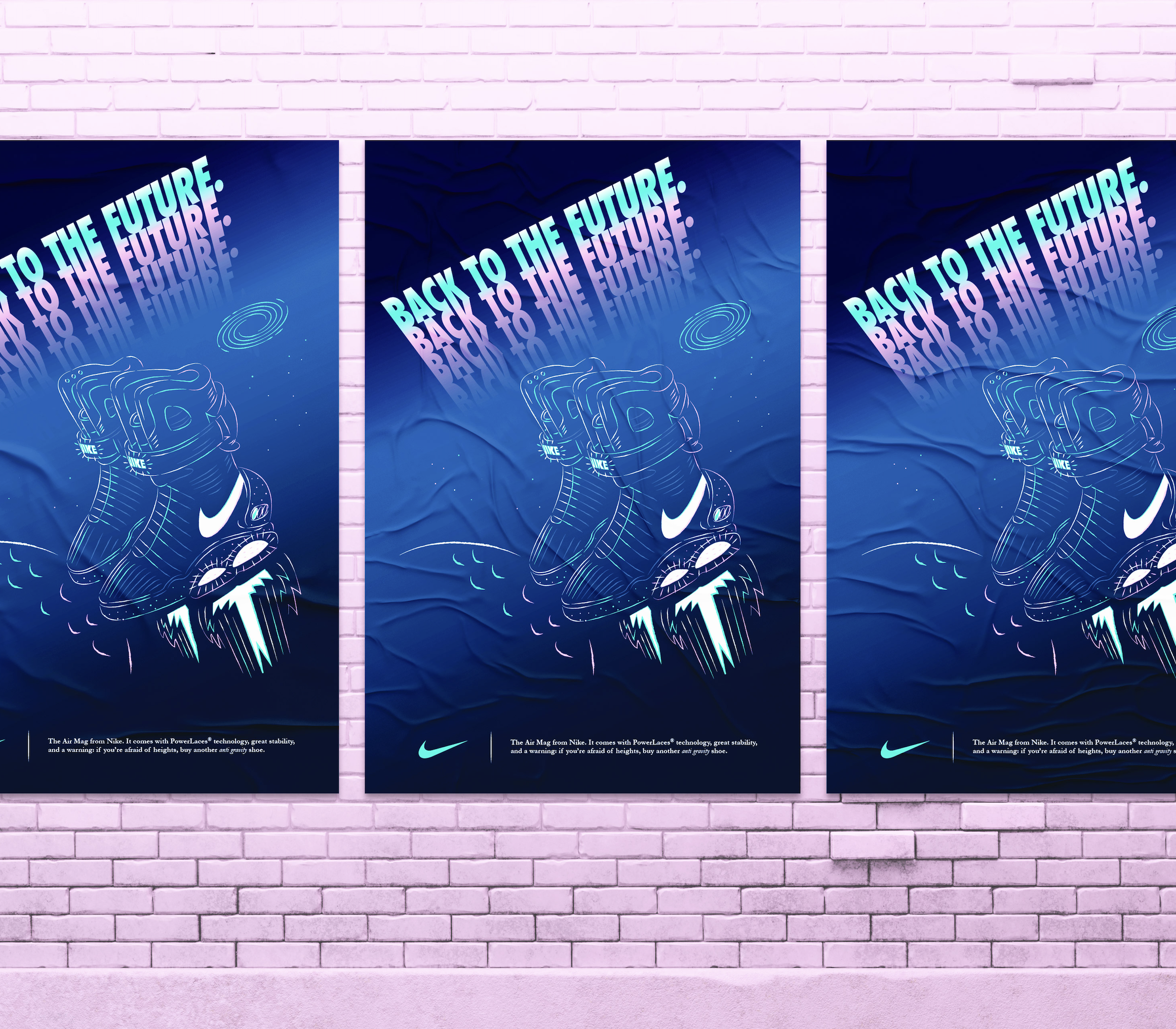
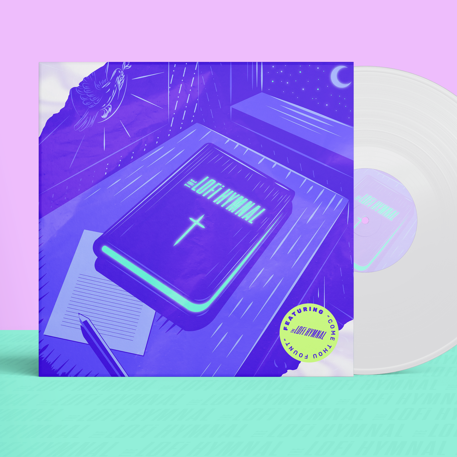
Most of the brand had been developed before I started, such as the logo, fonts, palette, and mascot. I took those elements and refined them for a more consistent look that reflected our vision. We wanted the app to feel very identifiable and modern, with the marketing materials incorporating a synthwave vibe.
Collaborators
Mellat Shegre: Marketing concepts and copywriting.
Ganesh Krishnan: UX design of app and collaboration on UI.
Unknown designer: Collaboration on graphics of rocket animation.
My Role
UI design of app, creation of digital ads, development of website, rebrand of mascot, custom icon and type illustrations, animation, and social media management.
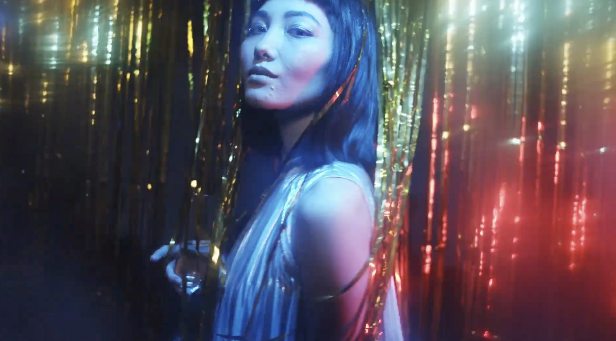
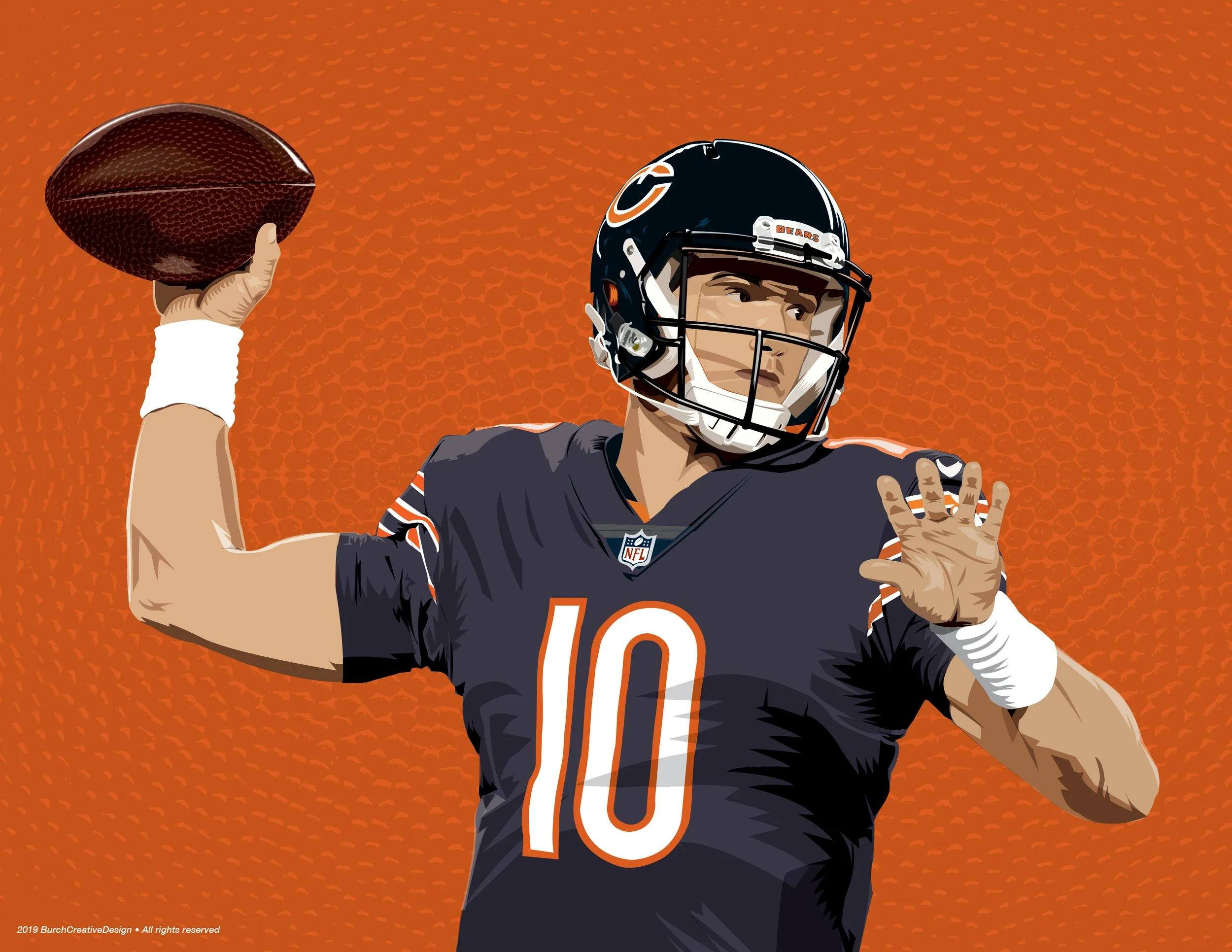
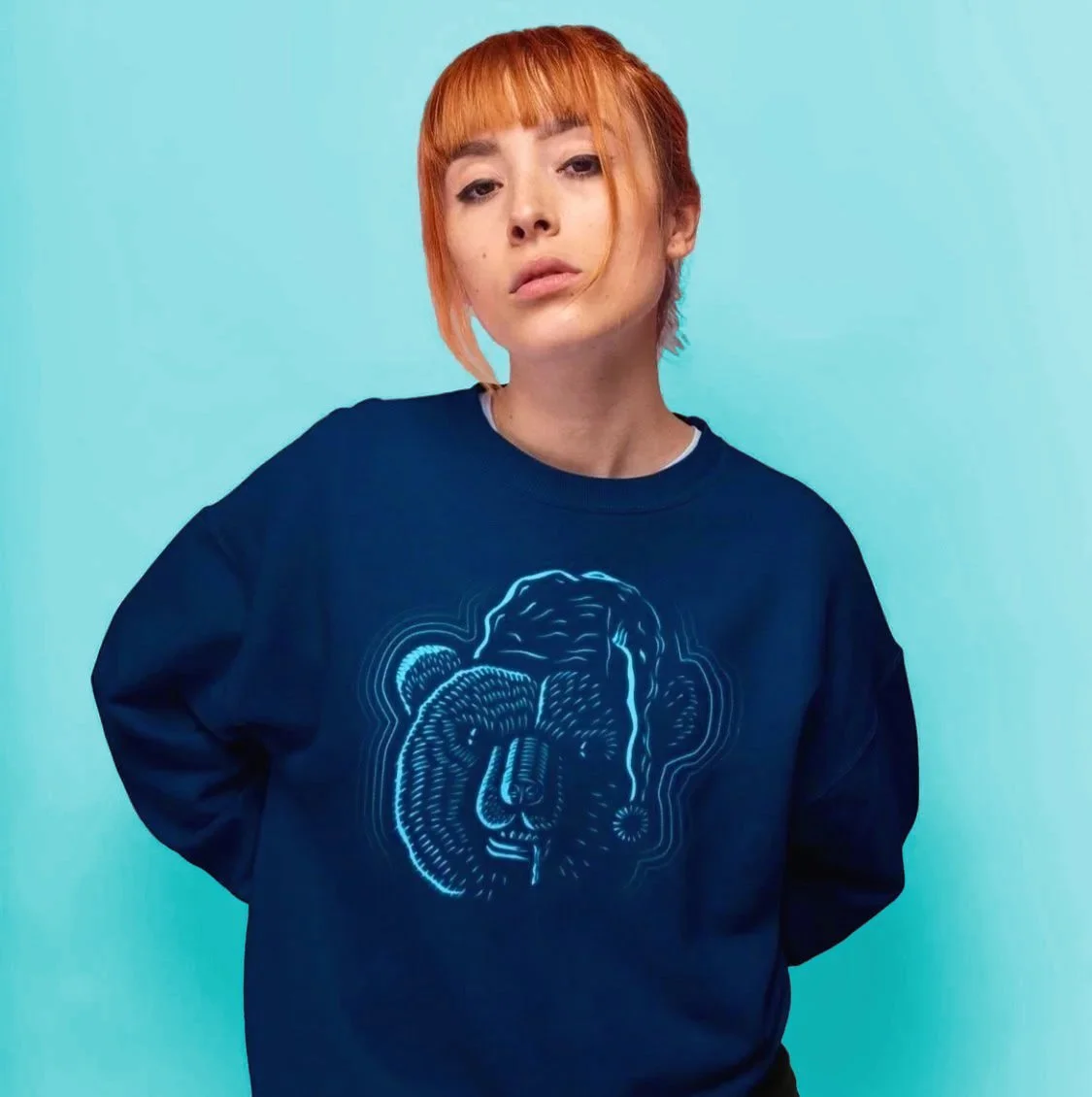
All photography is free-use/stock.