

Graphic Design
CASE STUDY
REBRAND • IDENTITY • COLLATERAL
STYLE GUIDE
Overview
The Mind’s Eye Interiors has been a successful furniture business in Hawaii for over 50 years. They offer island-styled furniture and decor that’s hand-selected by a team of designers. In 2021, BedMart acquired the company to be a sub-brand for their furniture products while building more locations across Hawaii. BedMart wanted to rebrand the Mind’s Eye to fit more in line with their business.
Timeline
1 month
Project Scope
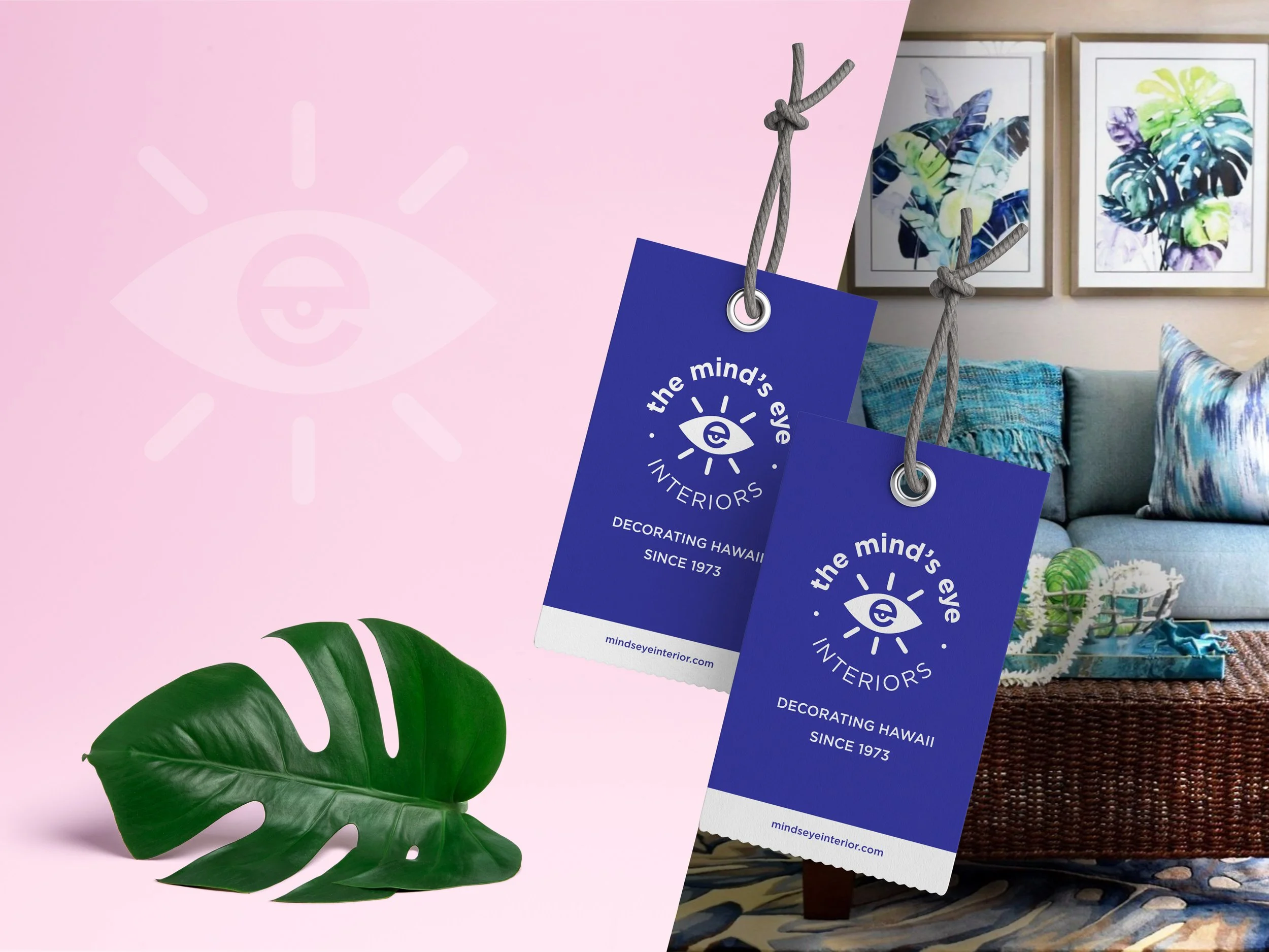
I was tasked with creating the identity for this rebrand with a new logo mark, color palette, and more. The logo would be the starting point for many pieces of collateral—which include hang tags, tape measurers, and shopping bags—that I would create down the road.
Research
Using inspiration from the decor of the Mind’s Eye designers and the colorful Hawaiian landscape, I had a lot of bright imagery to pull from. The client was looking for an “electric” palette that would complement the bright colors inside the store, while being easily identifiable within the busy patterns on the furniture. The font (Gotham) was pulled from BedMart’s branding, as this was intended to be an extension of that company. Since the Mind’s Eye has such a reputation in Maui, I tried to give a nod to the previous version with the eye symbol.
Execution
The final logo features lowercase type intended to create a more approachable experience, in contrast to the all-caps logo of old. The symbol conveys the mind’s eye concept with an “eye within an eye” graphic and sunrays (or eyelashes) coming from the center. Along with the logo, the palette complements the bright colors found inside and outside the store.
Conclusion
I’m proud to have been a part of this process and see this be applied to multiple Mind’s Eye locations—modernizing a historic brand tremendously.
Note: mindseyeinterior.com does not include the “s” like the logo, due to that domain previously being claimed.
Staged furniture photos created by MEI designers
Client: BedMart & Mind’s Eye Interiors
Team: BedMart Marketing Dept.
Role: Logo system, branding, and style guide development; creative direction and design of collateral